A blank canvas.
For students of design, it’s not just a means to an end. A clean slate—a masterpiece in waiting—is an essential tool in realizing their creative potential.
So when planning a complete renovation of the iconic Robert Venturi-designed building located at 3501 Market St., designers, architects and University officials wanted to harness the essence of endless possibility in creating the URBN Center—the raw, minimalist yet cutting-edge new home of the Antoinette Westphal College of Media Arts & Design.
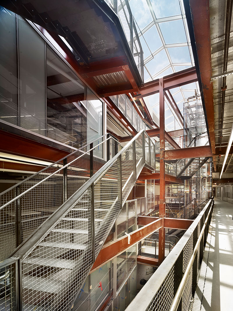
“The structure of the building is exposed, as well as the concrete floor, which has been really polished. It really has an urban look, but there is also a lot of glass and high-tech components with an open feel,” says Simone Pucca-Fera, the URBN Center’s project manager consultant, who has overseen various Drexel projects over the past four years. “The architects wanted to show the structure of the building and allow it to be an educational tool for students.”
The architectural firm MS&R was charged to adapt the 130,000-square-foot building, which was previously home to the Institute of Scientific Information. The URBN Center will house the college’s programs in architecture, arts administration, design and merchandising, digital media, entertainment and arts management, fashion design, graphic design, interior design, music industry and product design, as well as administrative offices and Historic Costume Collection.
Across the street at 3401 Filbert St., a 13,000-square-foot former daycare center is also being transformed as the URBN Center’s annex building, designed to house the Leonard Pearlstein Gallery, a multi-use screening and lecture room, and a black-box theater.
“At Westphal, we boldly re-imagine the world through inspired design, media and the arts,” says Allen Sabinson, Westphal’s dean. “Our faculty, distinguished leaders in their fields, challenge students to push the boundaries of creativity to transform the world around us.”
But designing a space that would be able to comfortably contain all of Westphal’s classrooms, critique rooms, office space and galleries proved to be a challenge. “The building is a square. It’s literally a box, meant for cubicle-style office space,” Pucca-Fera says. “That shape can make the building kind of dark.”
To accommodate, the architects inserted mezzanine levels surrounding an atrium that spans the height of the building and crests with a skylight, both of which will brighten the area while maximizing space.
“Besides having everything exposed and raw, one of the main ideas behind the space was to make it open for easy collaboration,” Pucca-Fera says.
The URBN Center’s main lobby was designed for just that. The open corridor will feature a prominent digital media screen that displays student work, plenty of informal meeting areas and lounges, an all-college Hybrid Making Studio that will offer student services from across Westphal’s disciplines to clients, and a café. The second floor and the second mezzanine will feature a large motion capture studio, compositing lab, gaming research facility and multiple high-end computer studios for animation, modeling and interactive design. “For a school of design, when prospective students walk through and see a space like that, it’s just cool,” Pucca-Fera says.
As students ascend the building via the open, grated staircase or the glass-encased elevator, they’ll find sewing labs and a CAD design studio, as well as a fabric dying and printing studio, a state-of-the-art fashion research lab, a SHIMA-SEIKI computerized knit prototyping studio and a runway for class critiques and informal fashion shows, and reconfigurable studio space. “I knew that if we did not improve the facilities, this college could not achieve its natural destiny,” Sabinson says. “Westphal has the potential to be one of the most elite design colleges in the country—that destiny is in our hands.”
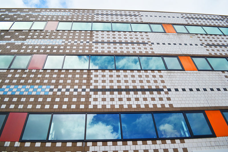
But as for the colorful, modular Market Street façade of the building, Pucca-Fera says it’s being left untouched. Though MS&R had originally proposed to expose the beam supporting the building’s cantilevered entrance, the University ultimately decided to preserve its original state. “The building’s front is not historical, but there’s an architectural community that feels strongly that it should stay as originally designed,” Pucca-Fera says.
Though the inside of the building was almost completely gutted, another original feature remains—a 10-foot, 8-inch by 33-foot, 6-inch mural titled “In the Garden” by Jennifer Bartlett. And aside from the blue and yellow exposed wires that trace the ceiling, the Bartlett mural is one of the space’s few pops of color. “There’s the gray concrete floor, the reddish, exposed steel, the piping and HVAC system above—you can see how it’s all connected,” Pucca-Fera says. “But the color that’s eventually going to populate the space is going to be derived from the artwork. … It’s the students that are going to be adding the color to this place.”


